“90% of people move between devices to accomplish a goal, whether that’s on smartphones, PCs, tablets or TV.” (source: Google)
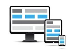
The continuous growth in mobile use and the release of multiple screen-sizes demands testing customer interaction and satisfaction of a website across devices.
The desktop and mobile versions of a responsive design were tested in a user research conducted for a major automotive brand. In addition to standard user research issues, we discovered insights related to device use and preference. Here are some key findings:
A Rich Mobile Experience Promotes Brand Perception
Participants were pleasantly surprised to have access to the same content and functionality across devices without being overwhelmed. Furthermore, the seamless shift between devices resulted in improved perception of the brand for many participants.
“61% of people have a better opinion of brands when they offer a good mobile experience.” (Source: Latitude)
Some Tasks are better on the Mobile Device
In addition to tasks that are commonly perceived as mobile-friendly (e.g. getting directions, or contacting a retailer), people appreciated the luxury of starting a task on one device and finishing it on another, thus having that information available anywhere and at all times.
Increasingly, people use their mobile device for convenience, not just when they are “on the go.”
Some examples of those types of tasks include:
- Reviewing a list of inventory
- Finding a local retailer
- Saving a wish list to show the sales person
- Getting directions to or calling a local retailer
In conclusion, the shift in responsive design is the natural next step to supporting the purchase process and promoting brand perception. The fluidity of responsive design across devices allows users easy access to do anything at anytime, anywhere.
“57% of users say they won’t recommend a business with a poorly designed mobile site. 41% have turned to a competitor site after a bad mobile experience.” (Source: Google)

Follow us